
Since late 2012, the LaneTerralever team has seen an overwhelming shift in mobile expectations for websites. A year ago, clients were telling us that mobile was a nice thing to have. Now, every client requires some sort of mobile readiness as a core strategy.
This made us wonder:
Mobile is popular, but what does it look like when it is executed correctly?
To answer this question, we looked at an expansive group of sites we expected to be mobile browser friendly: those of top U.S. colleges and universities. Despite having big money and a youthful, affluent audience, their mobile friendliness was generally dismal, with only 41 percent of the sites offering any kind of mobile optimized experience at all.
There are two dominant approaches to serving smartphone web browsers.
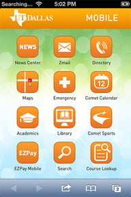
The first is to create an entirely separate version of the web site that is sent to people who try to connect using a mobile device. We often call this the "M-Dot" approach because these specialized versions are sometimes accessed by adding "m." to the front of the URL (e.g. http://m.facebook.com). Usually, M-Dot sites provide only a small fraction of the capabilities and content of the full site, but the information they do present is specifically tailored to work well on smaller screens and touch interfaces.
The other approach is to create a "responsive" site that can shrink, wrap and reorganize itself in response to varying screen sizes. Responsive sites often have access to nearly all the functions and content seen on a desktop, but they often make compromises in layout and usability.
Of these two approaches, the major universities seemed to prefer the responsive approach, with 25 percent serving a responsive page from their main homepage. Less common, 16 percent of universities were automatically serving an M-Dot experience from their main homepage.
America’s top educational institutions aren’t quite cutting it in the realm of mobile. So, we decided to go a step further and take a look at some of the weakest mobile experiences out there.
A quick web search revealed some very awkward user experiences. Some university websites are so poorly executed that only someone dying for information would put up with the misery. They are not suitable for casual browsing and are likely to cause users to avoid interacting with the site for even one second longer than necessary.
We also took a look at some of the M-Dot sites to see how they fared.
M-Dot sites can be an effective approach in some circumstances, but are often so devoid of content that they tend to get little traffic and high bounce rates.
So, what can a marketer can conclude from this?
In short, for most industries there is likely to still be a first-mover advantage in providing a decent mobile experience to web visitors. Furthermore, if you’re going to go mobile, responsive sites are definitely the tried-and-true approach for addressing mobile-readiness
Up next: How do you create a responsive website while leveraging the investment you've already made in your existing site?
Stay tuned for our next post!
METHODOLOGY
We examined the root domain homepage for 200+ universities taken from the US News and World Reports ranking of top US Colleges and Universities. We used a simple algorithm to determine if they were serving a mobile-targeted version of their primary domain homepage (e.g. fewer images, reduced functionality, simplified layout) or if they were serving a responsive version of their website (e.g. scaled and adapted to suite a mobile phone sized browser).

