Pop-ups. Overlays. Modals. Whatever you call them, they’ve more than likely gotten in your way a time or two when browsing the web.
When done wrong, pop-ups create an annoying barrier to the content or information you actually want to see. When done right, they create a helpful call to action that allows you to gain something valuable in return for giving you information.
What’s the difference between a good and bad pop-up? Empathy.
Empathy is the ability to understand and share the feelings of another, and should be the foundation for any content or experience you create for users. Especially pop-ups.
Creating empathetic pop-ups.
Empathy allows you to tap into a user’s intent, where they are in their journey and what they would find valuable in the next step of the experience.
For example, when a user has read three articles on the same site, it’s probably safe to assume that they dig the content and would be willing to give up their info in order to get updates from this source. At that moment, a pop-up inviting a user to subscribe to a newsletter seems more than appropriate.
Unfortunately, many marketers get the pop-up wrong, forget about a user’s feelings, and end up shoving unhelpful information in the way of content.
Here are three examples of some of the most irritating pop-ups, plus tips for crafting and serving a better, more empathetic experience.
BAD: The negative opt-in.
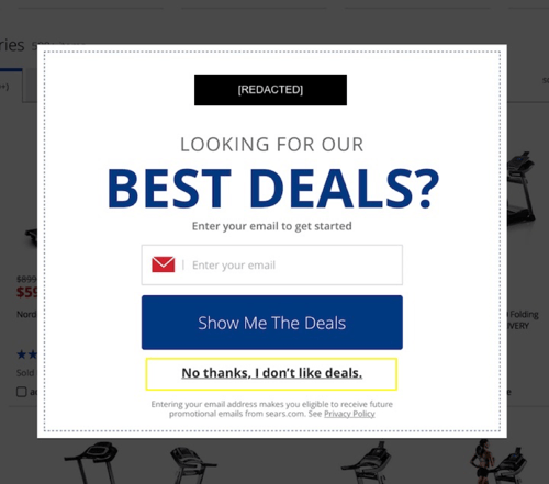
The negative opt-in pop-up is the one that makes your users feel like total morons for not signing up. Here’s an example, courtesy of a large department store, who shall remain nameless:

The choices are either give up your email for deals or admit that you’re a dummy who doesn’t like deals.
Just because a user doesn't want coupons for the latest Kardashian line (Whoops! Hope that didn’t give it away...) doesn’t mean they don’t like deals. They might just not be ready to commit at this point.
Another reason this pop-up misses the mark – it’s vague and unrelated to the content on the page (treadmills).
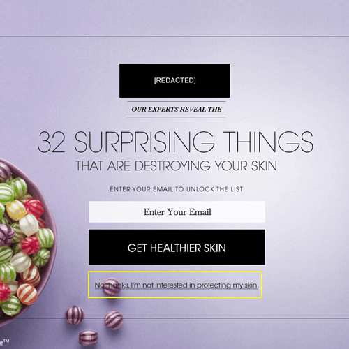
Here’s another negative gem from an online magazine:

It reads: “No thanks, I’m not interested in protecting my skin.” Opting out makes a user feel like they don’t take care of themselves.
Negative pop-ups come across as condescending. Opting out should never make a user feel like an idiot.
ADD EMPATHY: Keep your opt-out options simple and neutral with a “No thanks.”
These options let a user know you understand they’re not ready, and there’s no judgment.
BAD: Overly eager pop-ups.
These are served the moment a user lands on what they clicked through to. They get in the way, right away, and are akin to asking for marriage at the start of a first date.
Just because a user clicked through to one blog, one page, or one article does not mean they want to subscribe, sign up, or commit to whatever else is being offered.
Pump the brakes. Get to know what categories and topics a user is interested in, what types of content or products they keep going back to. Heck, just give them a few minutes to read whatever content is displayed on that first click.
Then serve a pop-up offering them something valuable in return for their information.
ADD EMPATHY: Play it cool with an exit pop-up.
Exit pop-ups display when a user moves their cursor towards the close button on their browser or tab. It provides users the opportunity to keep exploring your site, sign up for further communication, or even finish their checkout.
BAD: Automatic opt-ins for communication upon checkout.
Almost everybody does this. When a user enters their information to purchase or download something, they’re served a pre-selected opt-in for further communication.
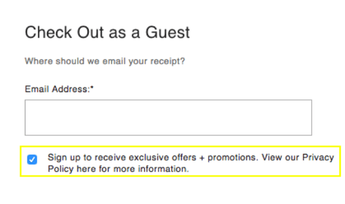
Here’s an example from a retailer’s online shopping cart experience:
 The tiny box was automatically checked off.
Obviously, it’s an easy fix to uncheck a box. But those boxes and text are typically tiny, making them easy to miss and making the whole practice feel like a shady way to get people into a marketing funnel.
Like, “Maybe they won’t notice and just accept the fact that we’re going to start blowing up their inbox with communication they didn’t even know they were signing up for”?
ADD EMPATHY: Give users a choice.
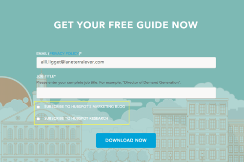
Let users have the choice to opt in, don’t automatically check it for them. Like this shining example from Hubspot.
A user enters their info to download a study, and here’s what they see – two beautifully unchecked boxes.


