
From blogs to photos, videos to whitepapers, content marketing has become a brand staple. 90% of marketers build their brands and pursue their goals with marketing content. Despite these numbers, less than half of marketers believe that their content is actually effective.
The bottom line is it is tough to place a value on social metrics like how much a like or share is actually worth to a brand as a whole, but that doesn’t mean there isn’t value there. The real task at hand is judging the right metrics to evaluate the success of content.
Which metrics matter?
Is the number of shares and likes sufficient to measure content’s success, or is there another metric that is more important? Recent studies show that numbers like content click through rate (CTR) have taken a back seat to measuring ad success to measurements like store visitation lifts (SVL) and secondary action rates (SAR). Absolute counts of likes, shares, and followers have also been examined and accredited as the definitive measure of content’s success.
Often in attempt to prove the return value on content, marketers painstakingly compile information from a multitude of sources like Google Analytics and Hootsuite and slap it into an excel spreadsheet. Once this information is compiled, communicating the relevance of it to clients and management is another obstacle in itself. While a spreadsheets are great organizational tools they are not visual or well received by audiences.
This is where the visuals or infographics come into play. People respond to imagery. A great example of this idea in practice comes from MIT and it shows that on Facebook, the engagement rate is 37% higher for posts with images. Another study from the Association for Consumer Research proves that pictures (or in print ads, illustrations) produce better learning.
Take a look at this example:
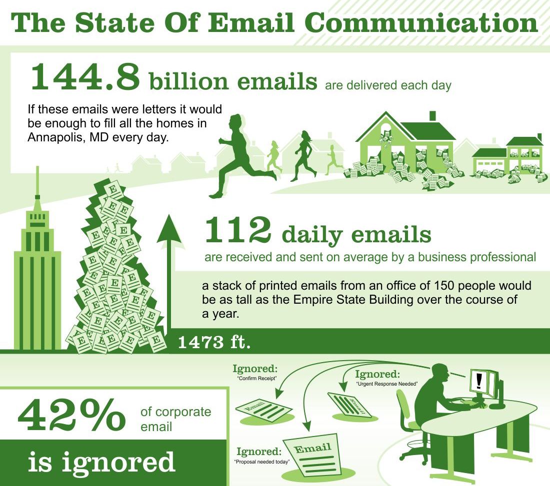
This info-graphic was created by Design Infographics
Explaining these email statistics could be done in a three-paragraph proposal or a one page Excel spreadsheet. I could easily tell you that 144.8 billion emails are sent per day and chances are it would be brushed off as an interestingly large number. However, by adding the visuals of houses overflowing with emails the numbers are unarguably more contextually received.
The Takeaway
If you want your audience or employer to better understand the value of marketing content metrics, go visual. Give your audience relatable images. You will initiate more effective learning and be able to better convey the value of your marketing efforts.


