

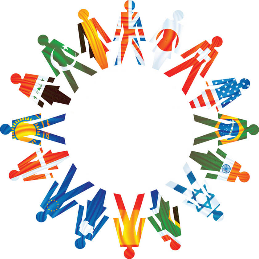
As Joe mentioned in Part 1, cross-cultural businesses require a high level of tact and expertise – which also rings true for building a website. There are a number of key elements that if overlooked, can make or break a project. These are the aspects that need to be accounted for in the early stages, in order to avoid an increasingly cumbersome project.
With that in mind, here are a couple things to consider:
Setting primary languages
Assistive technologies such as text-to-speech converters cannot sense the language of the content. The code needs to indicate what language the majority of the content is written in. For example, if the site was mostly in English, you would add this to the HTML element on each page:
![]()
For a multilingual site, the primary language should be set for each version of the page. W3C has more details here.
Changes in character length and font
Every language is entirely unique. One line of text in English could be pushed to two lines in Spanish, and three in Japanese. It’s one of the easiest ways to give yourself a headache. Make sure to allow space for these adjustments, and then thank the powers that enable Asian languages to be laid out left to right instead of remaining vertical!
Similarly, while the Roman alphabet can work well even on the small side, the detailed characters of languages such as Chinese, Japanese, and Arabic can be unreadable if they are too small. For languages like Arabic, there are specific typefaces that are recommended to increase legibility, especially on mobile. If the primary language is set in the html, a simple CSS modifier will keep everything readable:
![]()
Note that this is currently only supported by Firefox, Opera, and Internet Explorer 8 and higher.
Interaction Patterns
No two users are alike, but there are standard patterns that can be adhered to that will ensure ease of use. Web elements like navigation and calls to action are placed in specific places based on what is considered intuitive or common. This tends to vary by region, so it is important to learn what those differences might be before cementing the architecture of the website. If your teams are unsure, visit popular websites from that area in order to glean any nuances that need attention.
Keep in mind that all of these adjustments will be infinitely easier if the original design is clean and simple. That means modular and, in many cases, responsive. Clean design means that translation allowances, such as switching left-to-right pages to right-to-left for Arabic-speaking countries, will be a straightforward process.
Color associations
What might look a beautiful color palette in one country could send the wrong message in another. For example, in Western nations happiness is often associated with yellow, but in Japan that color can imply deceit. The strong Western association between pink and femininity is often lost in other cultures as well. This kind of miscommunication is an obvious hurdle for brands with strong color affiliations, but it does not necessarily require a new brand identity. Designers can still incorporate a logo in its original color in a meaningful way, but it should be balanced it with colors that conjure the desired associations.
For an overview of color associations by region, check out this great infographic by InformationIsBeautiful.net. I suggest saving this one; it’s a great reference to keep on hand.
Currencies
You must first distinguish locale-specific pricing and currency-specific pricing. A T-shirt from an American company might be priced at $30 USD, but cost £50 EUR for viewers in France due to increased shipping and handling costs. This is location-specific pricing, and it makes perfect sense. But what if the user is French-speaking, using the French version of the site to ship the T-shirt to his home in New York? A price difference wouldn’t make any sense. The process to rectify this issue is too long for this article, but Microsoft actually outlines your options well at the bottom of this page.
Adjustable images
Joe talked about the necessity of images that resonate with the audience according to their respective cultures. For a design perspective, you can take it a step further by suggesting you keep text completely separate from the images. If you are using the same image for multiple languages, it makes the duplication process far simpler.
Parting Thoughts
A global-friendly site takes just as much technological know-how as cultural awareness. Start with people who are familiar with international web builds and can provide the thoughtfulness the project demands. Commit to communication, interaction patterns that make sense for that region and always work with the end user in mind.
We know business. Learn how we can help you connect with your target customers, whether they’re in Bangkok, Berlin, or right here in the U.S. Let’s talk.
References & Further Reading
http://www.nomensa.com/blog/2010/7-tips-and-techniques-for-multi-lingual-website-accessibility/
http://msdn.microsoft.com/en-us/library/ee810357(v=cs.10).aspx


